 <style>
        div{
            width: 300px;
            border:  5px dotted #222;
            background: skyblue;
            padding: 35px;
            /* 테두리 아래 여백 : 20px */
            margin-bottom: 20px;
        }
        .bg1{
            /* 배경색이 테두리까지 */
            background-clip: border-box;
        }
        .bg2{
            /* 배경색이 테두리전, 패딩까지 */
            background-clip: padding-box;
        }
        .bg3{
            /* 배경색이 패딩전, 내용까지 */
            background-clip: content-box;
        }
    </style>
</head>
<body>
    <div class="bg1">
        <p>
            <strong>토마토:</strong>
            토마토는 비타민 A,C가 풍부할 뿐 아니라 희귀한 성분이 비타민 H와 P까지 포함된 과일이다.
            토마토는 비타민 A,C가 풍부할 뿐 아니라 희귀한 성분이 비타민 H와 P까지 포함된 과일이다.
            토마토는 비타민 A,C가 풍부할 뿐 아니라 희귀한 성분이 비타민 H와 P까지 포함된 과일이다.
            토마토는 비타민 A,C가 풍부할 뿐 아니라 희귀한 성분이 비타민 H와 P까지 포함된 과일이다.
        </p>
    </div>
    <div class="bg2">
        <p>
            <strong>토마토:</strong>
            토마토는 비타민 A,C가 풍부할 뿐 아니라 희귀한 성분이 비타민 H와 P까지 포함된 과일이다.
            토마토는 비타민 A,C가 풍부할 뿐 아니라 희귀한 성분이 비타민 H와 P까지 포함된 과일이다.
            토마토는 비타민 A,C가 풍부할 뿐 아니라 희귀한 성분이 비타민 H와 P까지 포함된 과일이다.
            토마토는 비타민 A,C가 풍부할 뿐 아니라 희귀한 성분이 비타민 H와 P까지 포함된 과일이다.
        </p>
    </div>
    <div class="bg3">
        <p>
            <strong>토마토:</strong>
            토마토는 비타민 A,C가 풍부할 뿐 아니라 희귀한 성분이 비타민 H와 P까지 포함된 과일이다.
            토마토는 비타민 A,C가 풍부할 뿐 아니라 희귀한 성분이 비타민 H와 P까지 포함된 과일이다.
            토마토는 비타민 A,C가 풍부할 뿐 아니라 희귀한 성분이 비타민 H와 P까지 포함된 과일이다.
            토마토는 비타민 A,C가 풍부할 뿐 아니라 희귀한 성분이 비타민 H와 P까지 포함된 과일이다.
        </p>
    </div>
</body>
<style>
        div{margin-bottom: 20px;}
        button{
            width: 140px;
            height: 50px;
            background-color: rgb(0, 110, 255);
            border: 1px solid rgb(0, 110, 255);
            color: #fff;
            font-weight: bold;
            /* 테두리 꼭지점 부분을 둥글게 처리 */
            border-radius: 8px;
        }
        #bg1{
            background-image:url(images/light.png);
            background-repeat: no-repeat;
            /* 가로 세로 px 만큼 배치 */
            background-position: 5px 7px;
        }
        #bg2{
            background-image:url(images/light.png);
            background-repeat: no-repeat;
            /* 수평은 오른쪽, 수직은 가운데 */
            background-position: right center;
        }
    </style>
</head>
<body>
    <div>
        <button id="bg1">
            IDEA
        </button>
    </div>
    <div>
        <button id="bg2">
            IDEA
        </button>
    </div>
</body>
bg-origin
<style>
        div{
            border: 15px solid #ccc;
            width: 400px;
            height: 200px;
            margin-bottom: 20px;
            padding: 35px
        }
        .bg1{
            background: url(images/bg3.jpg) no-repeat;
            /* padding-box 는 기본값 */
            /* 패딩까지 적용 */
            background-origin: padding-box;
        }
        .bg2{
            background: url(images/bg3.jpg) no-repeat;
            /* 테두리까지 이미지가 표시하므로, 보이지 않는 부분이 발생 */
            background-origin: border-box;
        }
        .bg3{
            background: url(images/bg3.jpg) no-repeat;
            /* 패딩을 제외한 내용까지 적용 */
            background-origin: content-box;
        }

    </style>
</head>
<body>
    <div class="bg1"></div>
    <div class="bg2"></div>
    <div class="bg3"></div>
</body>
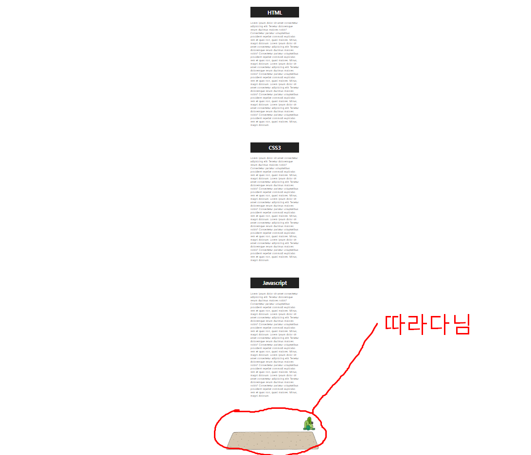
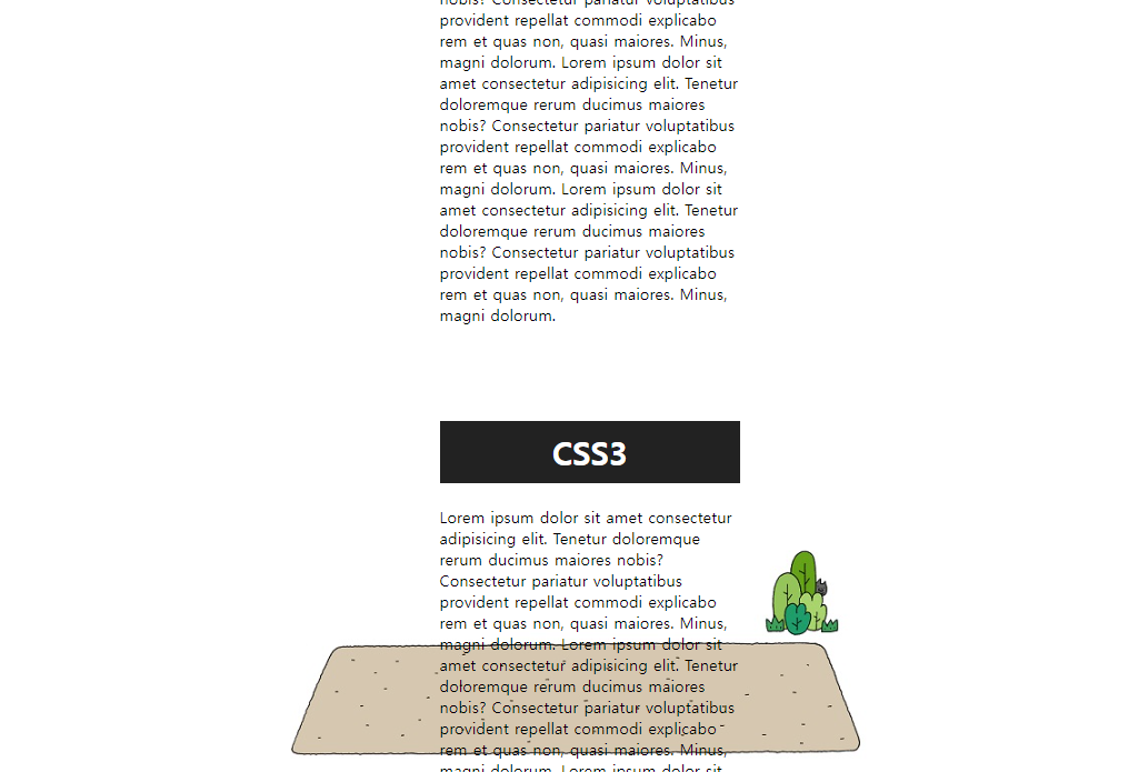
bg-attachment
<style>
        body{
            background-image: url(images/bottom-bg.jpg);
            background-repeat: no-repeat;
            background-position: center bottom;
            background-attachment: fixed;
        }
        div{
            width: 300px;
            padding: 20px;
            /* top:20px right:auto bottom:20px left:auto */
            /* margin: 20px auto 20px auto; */
            /* 바라보는 쪽 대비해서 생략 가능 */
            margin: 20px auto ;
        }
        h1{
            background-color: #222;
            color:  white;
            text-align: center;
            padding: 10px;
        }
    </style>
</head>
<body>
    <div>
        <h1>HTML</h1>
        <P>
            Lorem ipsum dolor sit amet consectetur adipisicing elit.
            Tenetur doloremque rerum ducimus maiores nobis?Consectetur pariatur voluptatibus provident repellat commodi explicabo rem et quas non, quasi maiores. Minus, magni dolorum.
            Lorem ipsum dolor sit amet consectetur adipisicing elit.
            Tenetur doloremque rerum ducimus maiores nobis?Consectetur pariatur voluptatibus provident repellat commodi explicabo rem et quas non, quasi maiores. Minus, magni dolorum.
            Lorem ipsum dolor sit amet consectetur adipisicing elit.
            Tenetur doloremque rerum ducimus maiores nobis?Consectetur pariatur voluptatibus provident repellat commodi explicabo rem et quas non, quasi maiores. Minus, magni dolorum.
            Lorem ipsum dolor sit amet consectetur adipisicing elit.
            Tenetur doloremque rerum ducimus maiores nobis?Consectetur pariatur voluptatibus provident repellat commodi explicabo rem et quas non, quasi maiores. Minus, magni dolorum.
            Lorem ipsum dolor sit amet consectetur adipisicing elit.
            Tenetur doloremque rerum ducimus maiores nobis?Consectetur pariatur voluptatibus provident repellat commodi explicabo rem et quas non, quasi maiores. Minus, magni dolorum.

        </P>
    </div>
    <div>
        <h1>CSS3</h1>
        <P>
            Lorem ipsum dolor sit amet consectetur adipisicing elit.
            이하 생략
        </P>
    </div>
    <div>
        <h1>Javascript</h1>
        <P>
            Lorem ipsum dolor sit amet consectetur adipisicing elit.
            이하 생략
        </P>
    </div>
</body>


